Exploratory Practice
Week 1
Week 1 consisted of research and exploratory sketches. The aim for this unit was to create a cohesive group of characters for an existing IP. We decided on revolving our project around the League of Legends franchise. This meant that not only were we looking at the main game itself but also conducting research on its related spinoffs such as Legends of Runeterra, Arcane, and the upcoming ‘Project L’.
My group and I set up a shared Pinterest board to collect reference images and set the tone for this project. The mood board was far too big to include all of the reference images here, but in summary, we included artwork that fit the aesthetic we we aiming for, as well as some reference images of real sea creatures. Our group collectively agreed that we will be creating a set of characters for the Bilgewater region in League of Legends’ fictional world – Runeterra. Specifically, we wanted to create a gang of ‘vastaya’ (humanoid creatures with animal-inspired features) inspired by the ‘Marai’ race. Our main tagline for the project was ‘Bilgewater Shark Pirate Gang’, just to remind ourselves clearly what our main objective was for the project.
Coming Up With a Story
Bilgewater is a region in Runeterra where many of the game’s pirate characters come from. It consists of many pirate gangs, with a hierarchy that favors the biggest and strongest band of pirates. To deepen our understanding of the world and create an interesting story for our group, we decided to research about the lore and fictional history of Bilgewater. Through our research, we found that the most significant gang is run by the playable character, Miss Fortune, who overthrew the previous captain, Gangplank. We also found other stories of League of Legends champions to refer to. Pyke is the embodiment of the ‘dead-man-walking’ phrase, having defied permanent death just by sheer anger and vengeance towards his own crew that betrayed him. There is also a cult-like group living in Bilgewater, where Illaoi lives, called the Buhru tribe that worships a kraken-like god. The last significant playable character from Bilgewater is Fizz. He is a species called a ‘yordle’ that come from a different dimension but are able to visit Runeterra. His story is the simplest; just a creature who loves to pull pranks and cause chaos.
From all of the stories we read, we decided to narrate a light-hearted story about an unexpected group of friends. We imagined our gang to look like serious pirates on the surface, but are actually just fishermen who love to catch the biggest fish and even fight sea monsters sometimes. From time to time, the gang gets hired as ‘extra muscle’ to intimidate enemies, or as temporary crew members for the understaffed ship.
Creating the Character
To initiate the process of creating a strong character design, I first picked an archetype for the type of playable character I was making for the game. I decided to pick the ‘tank’ class for this character. Tanks in League of Legends have the main responsibility of absorbing a lot of damage for the team. I decided to thumbnail my initial ideas through blocks of shapes rather than sketches so that I could focus on creating strong and recognizable silhouettes. Tanks generally have a bulkier silhouette because of elements such as muscles and armor to show their strength and ability to block or take damage. Even though my main focus was to create a bulky character, I still played around with proportions. Furthermore, I added typical pirate props such as anchors, hooks, cutlasses and peg-legs to emphasize the pirate theme that comes with the Bilgewater region.
I decided to explore two main archetypes for this large character. Character 1 explores a loud, boisterous and energetic character. I emphasized this with the use of pointy shape language. After doing a bit of research on pirates, I learnt that there are different types of crewmembers. One of those members would be a chef or cook. This inspired character 2 to be a silent but sweet gentle-giant archetype who loves to cook food for his friends and crewmembers. While character 1 had a lot of elements that make up a League of Legends champion, character 2 ended having a lot of design details that make for an endearing story. The big knife and apron were design choices to embody the character’s main profession, which is a cook. The ropes, hooks and raggedy clothes were included to show that this character comes from Bilgewater. Lastly, my favorite aspect of these sketches was the inclusion of fishnets as friendship bracelets/necklaces. I imagined this character to communicate his feelings towards his friends by collecting shells from the beaches and teeth from their proudest catches and weaving them into wearable tokens of friendship. The design on the left particularly shows off a lot of the charm of the character because his neck piece is meant to be a fishing net that he has fashioned into a friendship necklace by clumsily hanging a bunch of things he likes (his big hands prevent him from being able to weave proper dainty accessories). Many peers and also tutors fell in love with character 2, so I took it as a good sign that I had come up with a strong design idea.
I used some Bilgewater artwork as reference. Bilgewater is quite dirty and unkempt, which I mirrored in these sketches to show which region of Runeterra the character comes from.
While waiting for feedback from my tutors, I decided to explore some prop ideas. I thought about what kinds of things my character would have. I ended up thinking of a basket where he would keep all of his freshly caught fish before taking them to the kitchen. Secondly, I thought of a waterskin. Since the group would spend a lot of time out in the ocean, he might have a waterskin to keep him hydrated while at sea. Lastly, I thought of a dagger. He might need to cut a rope or defend himself from a dangerous sea creature – of course, he wouldn’t use his cooking knife because he doesn’t want to contaminate the food he prepares for his precious crewmembers. Playing off of the idea of this character liking arts and crafts projects, I thought he might want to carve a large fish tooth into a tool and wrap scraps of rope, fabric and shells to embellish it.
Week 2
Developments Through Feedback
This week, I aimed to finalize my character design. I got some feedback from peers and tutors about my group’s preferred design. I mixed and matched all of our favorite design elements and sent them off again to a 2D tutor for review. The tutor (in blue) drew some notes on top of my current sketches. He made a lot of really good points that I hadn’t thought of at the time because I have been staring at these drawings nonstop for the past two weeks. Another tutor also discussed the head design with me. He said how the head didn’t read as ‘shark’ and to either lean into the shark inspiration more or try other sea creatures. I decided to take inspiration from beluga whales because they fit the round shape language much better than the sharp shape language of shark anatomy. This change resulted in a much more friendly-looking character. With these notes in mind, I proceeded to finalize my design and move on to a turnaround.
At some point, I was conflicted about the necklace design element so I consulted my group mates for feedback. Although I was given some useful feedback as well as educated opinions about design, I ended up keeping the necklace but sacrificing the fishing net idea for the sake of a stronger in-game read. As someone who plays League of Legends frequently, I am well aware that character models are very small so champion designs tend to be on the simpler side with exaggerated points of interest. A strong example would be below:
This character mostly consists of big shapes where focal points lie. Small shapes are simple and easy to read but not distracting. Lastly, colour is used to draw the eye towards points of interest, which I’ll be exploring later.
As my final tweaks to the sketch, my groupmate also asked if I could try and add a tail to the design. However, We both felt like it was a bit unbalanced and weakened the round silhouette of the character.
Overall, I felt like I was able to create a very interesting character with lots of storytelling in mind. I feel proud of myself because I was able to balance my own design opinions and storytelling with helpful feedback – which resulted in a design that I felt proud of. I got a lot of encouraging responses whenever I showed this idea and I’m looking forward to the next stages of the project.
Week 3
Turnaround and 3D
To prepare for 3D modelling, I started by making a turnaround sheet. I didn’t include the knife prop here for the time being because I wanted to see if I could develop it further while I model and sculpt the body.
On top of my turnarounds, I made an expression sheet. During my free time, I watched a video critiquing character design portfolios. I learnt a lot about portfolio layout and content to include, which I will be applying to my submission portfolio for this project. The critic said that turnaround sheets are nice to add to a portfolio to show your technical skill. However, she also highly recommended to include a pose and expression sheet. She explains that it can be a good way to display your understanding of volumes as well as your skills in storytelling through gesture and facial expressions. A quick tip I learnt from this video is to make your characters connect with something aside from the camera to create a quick story. Here, I had Bait look at a necklace he made, cook food, and play with a dragonfly to illustrate his gentle and playful personality.
3D Modelling
I made a very low-poly base mesh in Maya to make sure my proportions are accurate. My tutors suggested to maybe start in ZBrush but I opted to start in Maya because I feel more comfortable with it. I ended up making a few elements such as the fins, necklace and pendants bigger than in the sketch because they looked so awkwardly small compared to the exaggerated body. During this part, my tutor also taught me about deformation handles. In particular, he taught me about non-linear deformations like ‘twist’ and ‘bend’. I was able to apply this new knowledge to create a quick rope necklace.
After sculpting the base muscle masses in ZBrush, I created a mask for the top and utilized different brushes to bring out the forms of the clothing. I used inflate to define the edges of the tank top and also used the Standard circle brush, Damian Standard brush and the Smooth brush to add wrinkles and folds on the cloth.
Overall, I was able to finish creating high poly models for each object of my base mesh this week. I was able to complete a lot of work and am looking forward to baking and creating colour schemes next week!
Week 4
Props and Retopology
Bait was still missing a main weapon/prop to use in-game. I decided to do more research in order to gather some ideas for what Bait’s weapon could be.
I sent my ZBrush sculpt to a tutor because I thought that his arm looked really off and I couldn’t seem to fix it myself. My tutor made this quick draw-over to remind me of anatomy fundamentals. I was able to quickly fix my anatomy issues and retopologize all of my sculpted assets.
League of Legends Research
Playable ability analysis
Word document of my research
After careful consideration and peer feedback, I concluded that a pan would be the most fitting for Bait as a character. Bait wouldn’t use any sharp weapons because it would be much too violent for his friendly nature. I created his in-game abilities to reflect how he would want to protect his friends by pushing enemies away or giving his friends a means of escape or safety. I thought that a pan worked really well with Bait’s identity and I was able to create abilities that were both fun and fulfill his role as a tank/support hybrid class.
Week 5
Color Palettes from History, UV, Baking and Texturing
Before texturing, I had to pick a color palette. I drew a quick sketch of Bait, separated the different assets and tried out different color combinations inspired by the Bilgewater region.
I wasn’t satisfied with how these turned out so I reworked them to make them more presentable:
For the decals and patterns, I ended up doing some more historical research on pirates. I learnt that pirates originated around the Mediterranean Sea. Pirates came mainly from the countries surrounding that sea, including countries from northern Africa, Southern Europe and a few Middle-Eastern countries too. I looked at traditional patterns from Greece, Morocco, Spain etc and incorporated those into my palettes. Learning about real history made my design so much better because the added context contributed a lot of depth to the character design and even opened up new possibilities for subtle story-telling. Below are some of the patterns that inspired the decals and tattoos I used in my designs.
I decided to use Substance Painter to bake and texture my model because the features seemed the easiest to use. I really liked the visualizers in this software because it was easy to understand. The visualizers also highlighted points where there would be baking errors, which helped me quickly fix those problems.
I wanted to imitate League of Legends’ in-game models with their hand-painted, stylized textures. However, I wasn’t able to hand-paint them as planned because all of the pen tablets at my rental store on-campus were fully booked until next term. I had to improvise and watched a few tutorials on YouTube on mimicking hand-painted textures. I learnt about filters and generators on Substance Painter. In particular, I used the Blur Slope filter to make the gradients much less uniform.
I used a site called teemo.gg to view in-game League of Legends models. It’s very subtle but every in-game model in League of Legends has a slight gradient where it’s darker at the bottom. This makes the character easier to read in game and subtly brings the eyes upwards, towards the focal point. In Substance Painter, I used the positional generator along with an inverted thickness generator to bring out highlights closer to the top of the model.
At this point, I decided to send my progress to a tutor for feedback.
He was right; my UV layout wasn’t the most efficient. I’m losing a lot of resolution by making my shells too small. I also agreed that my model looked too blocky in certain areas and decided to head back into Maya to add more polys to my low-poly mesh and shuffled the UVs around to maximize space.
While I was busy finicking with those, I tried to find a way to add bait’s body markings to the textures. I tried stamping real tiger textures onto his body but it looked strange on top of his stylized features. I also tried painting them on myself with a mouse (still no tablets available to rent at the time) but they looked really janky.
In the end, I decided to consult another tutor about it. I was aiming to just use the model to paint over to save time on my splash art so I asked a tutor if it was important to add the stripes in right now.
With this response, I decided to just leave the stripes alone for now and just proceeded to finish redoing my baking. I was able to export my working folder in Substance Painter to create a smart material, which I will use for my other assets.
During this part, I was really struggling to add patterns to the trousers. My groupmate recommended I add it in as a decal. I basically made my own brush by making an Alpha in Photoshop as a stencil and I made a color version of it as the color output.
Week 6
Thumbnails, Rigging and Posing
While finishing up textures for the rest of the 3D assets (I just drag and drop the same smart material on Substance Painter), I began to start thinking about compositions for my splash art. I wasn’t sure where to begin in terms of drawing so I started by doing some brainstorming and research.
Week 7
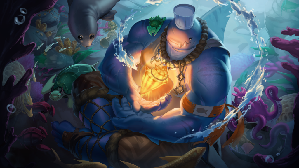
Once I developed some gray scale thumbnails, I consulted a tutor to help me decide the most fitting composition for the character. I decided to go for C because it felt very intimate and magical. Additionally, the secondary characters were a great opportunity to create a narrative and also frame the character.
Things were going smoothly up until I started to add color to the render. When I transitioned from grays to colors, the color range started to look off. I just assumed that this was normal since gray scale isn’t great at capturing hue shifts. I kept trying to work into it with color but it just kept getting worse the more I meddled with it. Once I had enough of struggling, I sent what I had to a tutor for feedback. My tutor recommended that I start again and to try rendering from color rather than from gray scale. To be honest, I was a bit skeptical at first since I already spent so much time rendering what I had. In the end, it ended up being really good for my work.
Here is a progress photo of the new version of the splash illustration. I ended up ditching the magical shield since it felt quite distracting. Instead, I used environment, secondary characters and effects to lead the eye towards the focal point. Here, I also included references for certain elements in the illustration that I was struggling to paint.
Overall, this week had a rough start but I think I really pulled through at the end and began to head towards a much stronger outcome than I initially planned.
Week 8
This week, I focused on polishing elements and separating layers in preparation for animation in After Effects. I also finished the rig for my 3D model of Bait. Above is a screenshot of my progress for the splash illustration along with some notes for myself as I am working towards the finished product.
This week was quite slow since I kept finding little bits that were under-rendered and I needed to polish them properly to match the quality of work on other parts of the illustration. However, I thought that the extra effort was worth it since the small details really added a lot of magic and story to the illustration. For example, I added weathering to the little bits of leather on Bait, which I could’ve just left alone to save time, but by doing so, I was able to narrate that Bait is a hard worker and not in a line of work that allows him to replace his worn out clothes so easily. I will also be adding some weathering to other bits of cloth around him.
Week 9
Week 9 was quite slow; just mostly cleaning up layers and polishing.
Week 10
After getting some last bits of feedback for rendering, this is the final painting. I’ll do some adjustments and lighting animation on Adobe After Effects, but otherwise, I’m completely finished with painting and separating layers. This week, I moved on to animating the illustration.
Week 11/12
Week 11 and 12 were focused on animating on Adobe After Effects. It was a bit difficult at first but eventually, I got the hang of it. I was even able to broaden how I utilise tools in the software. In particular, I was able to manipulate video overlays using blend modes and masks. In the screenshot above, I didn’t want the dust particles to cover Bait, so I created an ellipse mask, inverted it, and then feathered it so it makes a smooth transition.
Outcome
This is my final outcome for this unit. I had so much fun on this unit and I felt in-the-zone for pretty much all of it. It was so immersive to create a set of characters with a group because we had so many fun ideas that developed our characters’ group dynamic and story. In particular, we found it hilarious how we initially planned for our characters to be a fearsome group of pirates, but they somehow developed into a trio of chaotic fish(er) men [that was a pun].
Although not all of my projects in my studies will be group work, I still found a lot of value in confiding in my peers and tutors for feedback and ideas, so I will definitely be coming to them for help more often. Critical feedback and ideas given to me by others were key in helping create a character that feels more whole, both design-wise and story-wise.
I’ve also developed my 2D skills in character design, as well as illustration. I really feel like I pushed my limits further in this project and will be going into my next project with a more confident skill set and an eagerness to push myself even further.